

I happened to (accidentally) catch some of Queen Elizabeth II’s Diamond Jubilee on the TVs at a restaurant a few weeks ago…
[image lightbox=”false” width=”full”]https://goinginteractive.com/wp-content/uploads/2012/06/queen_guide.jpg[/image]
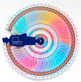
Didn’t really notice the color scheme to the celebration as it looked like it was pouring down rain in the broadcast. But interestingly enough, advertising agency Leo Burnett London and PANTONE teamed up to release a special limited edition color guide to commemorate and showcase the Queen’s color statements throughout her 60 year reign.
The Queen’s decision to “favour one colour in every outfit is a strong style statement”, according to Leatrice Eiseman, executive director of the Pantone Color Institute. “Monochromatic colour schemes make the wearer appear taller, delivering a more stately air – perfect given that Queen Elizabeth is not tall at 5’4’’. Choosing one colour theme also ensures the outfit does not detract attention from the wearer – which is particularly important if you’re the Queen.”
We agree. Maybe we’ll be able to use some of the colors in future web work. In any case it’s a nifty little Pantone color book!
Check out the full press release on PANTONE’s UK site here.